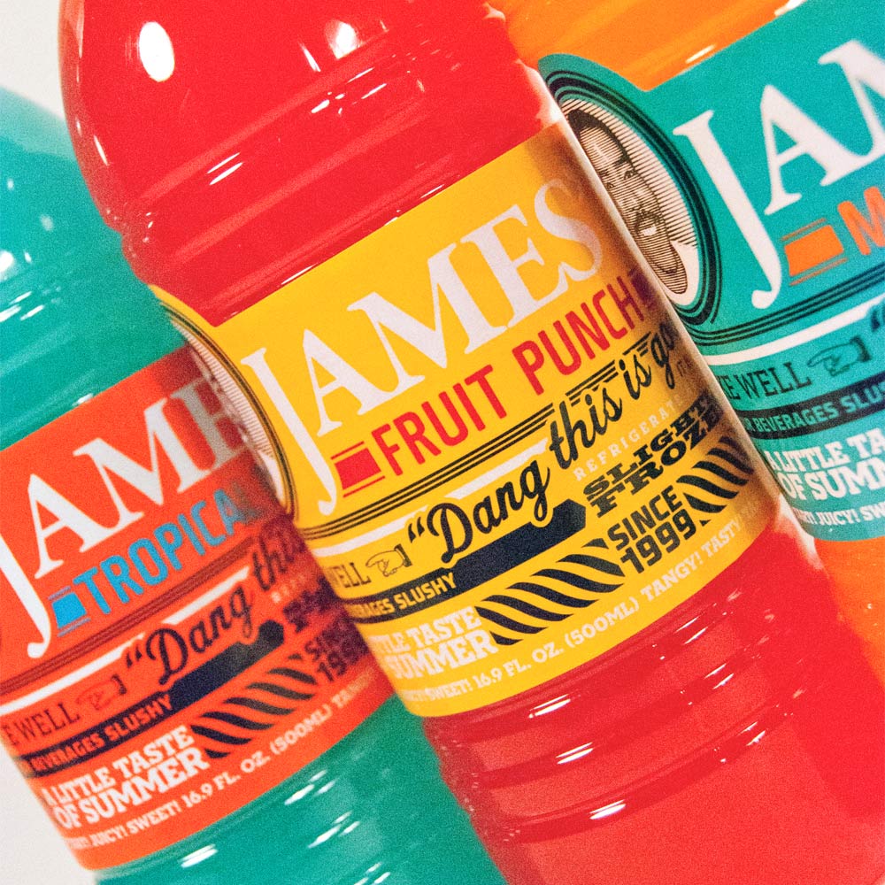
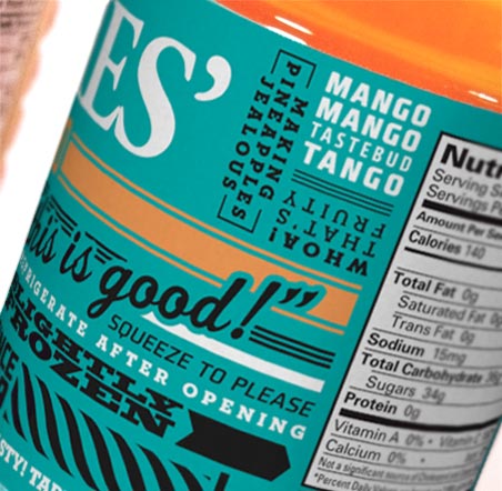
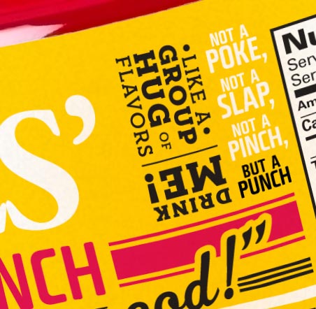
James Anderson has been selling his family’s lemonade (and his other clever drink concoctions) for more than a decade. In need of broader appeal without disconnecting his roots, new packaging for his line of 7 sweet drinks was developed. A combination of new colors with quirky copy bring James’ history and personality to the forefront. A great collaborative project for a great Kansas City business.


CREDITS:
Designers: Rob Mitchell and Jim Dore // Copywriter: Jim Dore // Creative Directors: Paul Diamond & Brian Merckens
AWARDS:
2011 Kansas City A7 Design Award

