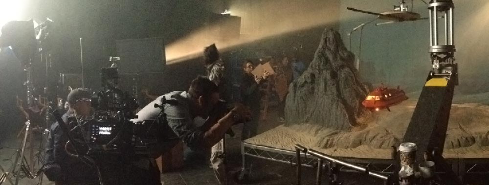
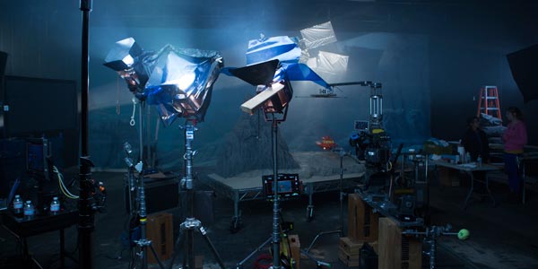
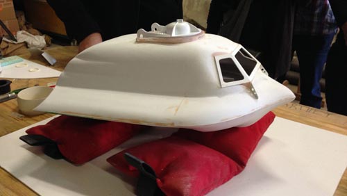
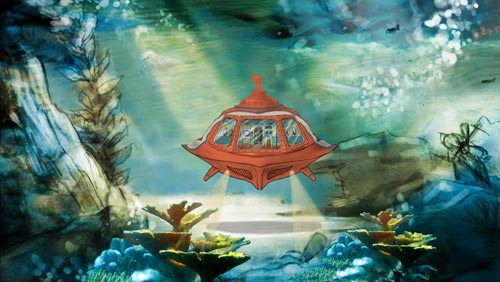
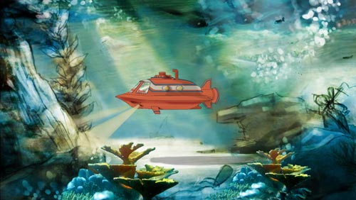
The Filet-O-Fish is unlike any other product on the McDonald’s menu. Its advertising also has a history of standing out from the rest of the brand. For this year’s national TV push we decided to take audiences on a whimsical, musically driven deep sea adventure. It’s all totally inspired by underwater adventure films of the 1950s. In fact, we used many of the same production techniques. The sub is a miniature, and the background is a 40-foot piece of hand-painted canvas that was actually used in the production of 20,000 Leagues Under the Sea from 1954.
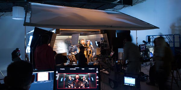
How’d we do it? Two sets, a great production team and some old-fashioned movie magic. Oh, and a mini-mini-sub.
Thanks to the internet giving everyone a microphone, we were part of the conversation. Just like the sandwich, the reaction was pretty polarizing. Lots of people liked it. And some… didn’t. But they certainly talked about it.
CREDITS:
Art Director: Jim Dore // Copywriter: Joe DeSalvo // Director: Jared Hess // Music: Mark Mothersbaugh // DP: Mattias Troelstrup // Editor: Pete Meyer // Post Production: Jono Gaughan


